ggplot2控制坐标轴截距交点位置
时间:2020-08-11 来源:生信自学网 作者:刘鑫
微信公众号:biowolf_cn 点击:次
ggplot2控制坐标轴截距交点位置
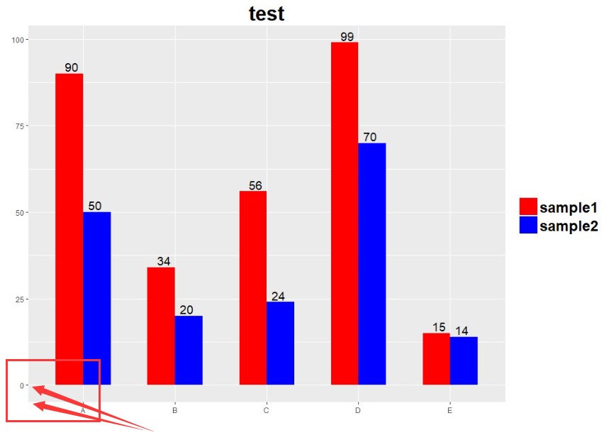
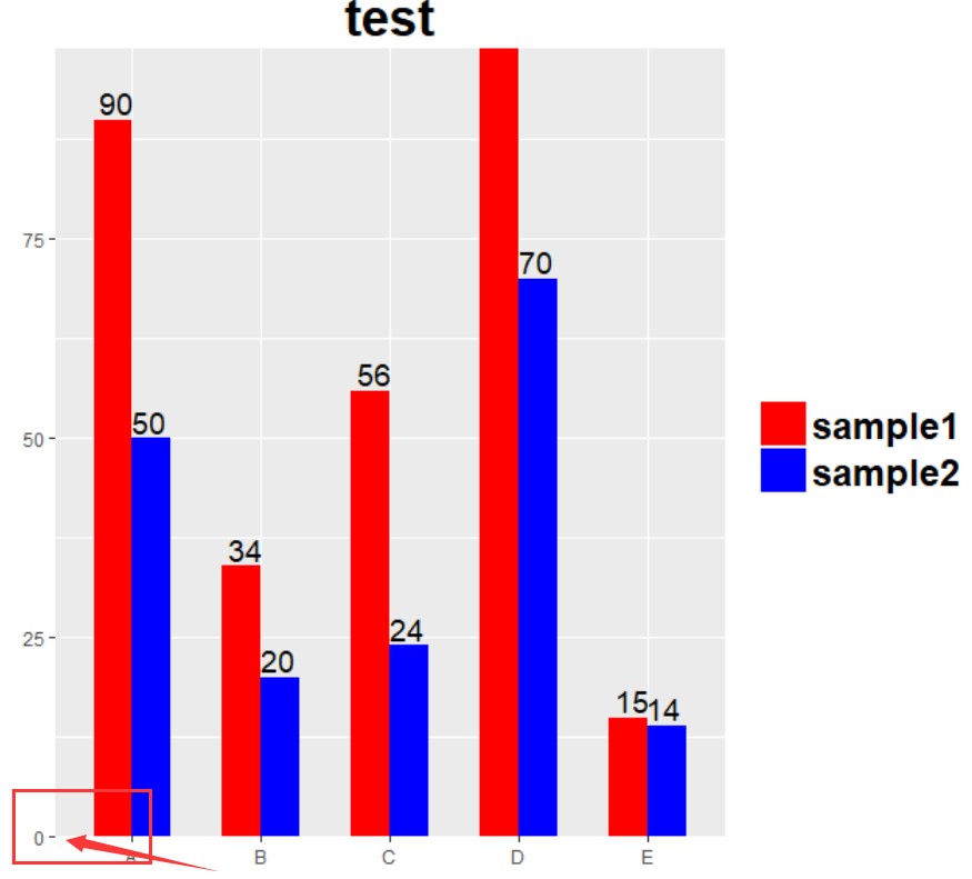
ggplot2绘图结果往往X轴和Y轴的交点往往不是原点:譬如下图y轴就不是起始于0 调整坐标起始位点可以利用scale_y_continuous(expand = c(0, 0))或者scale_x_continuous(expand = c(0, 0)) expa...
ggplot2绘图结果往往X轴和Y轴的截距交点往往不是原点:譬如下图y轴就不是起始于0
expand的解释如下
利用ggplot2绘制分组柱状图,并进行组内分隔。 加载R包、设置数据
library('ggplot2')
library('reshape2')

A = c("A","B","C","D","E")
B = c(90,34,56,99,15)
C = c(50,20,24,70,14)

dat = data.frame(A,B,C)
names(dat) = c("type","sample1","sample2")
dat = melt(dat,variable.name="Sample",value.name = "Num")
head(dat)
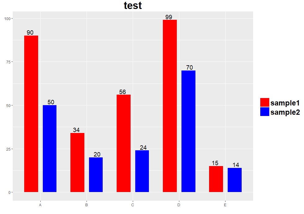
绘制分组柱状图
p = ggplot(dat, aes(x = type,y = Num,fill = Sample))+
    #####这部分的position = "dodge",并排肩并肩的柱状图
    geom_bar(stat ="identity",width = 0.6,position = "dodge")+
    scale_fill_manual(values = c("red","blue"))+                 #########设定颜色
    labs(x = "",y = "", title = "test")+                        ############坐标标签和图片title
    geom_text(aes(label = dat$Num),position=position_dodge(width = 0.5),size = 5,vjust = -0.25)+ ###########设置柱子上的标签文字,文字的position_dodge(width=0.5)设置,保证分隔宽度。
    guides(fill = guide_legend(reverse = F))+                  ##############图例顺序反转
    theme(plot.title = element_text(size = 25,face = "bold", vjust = 0.5, hjust = 0.5),   ######图片title文字大小位置
        legend.title = element_blank(),                    ##########图例名称为空
        legend.text = element_text(size = 18, face = "bold"),        ##########图例文字大小
        legend.position = 'right',               ############图例位置
        legend.key.size=unit(0.8,'cm'))             #############图例大小

print(p)
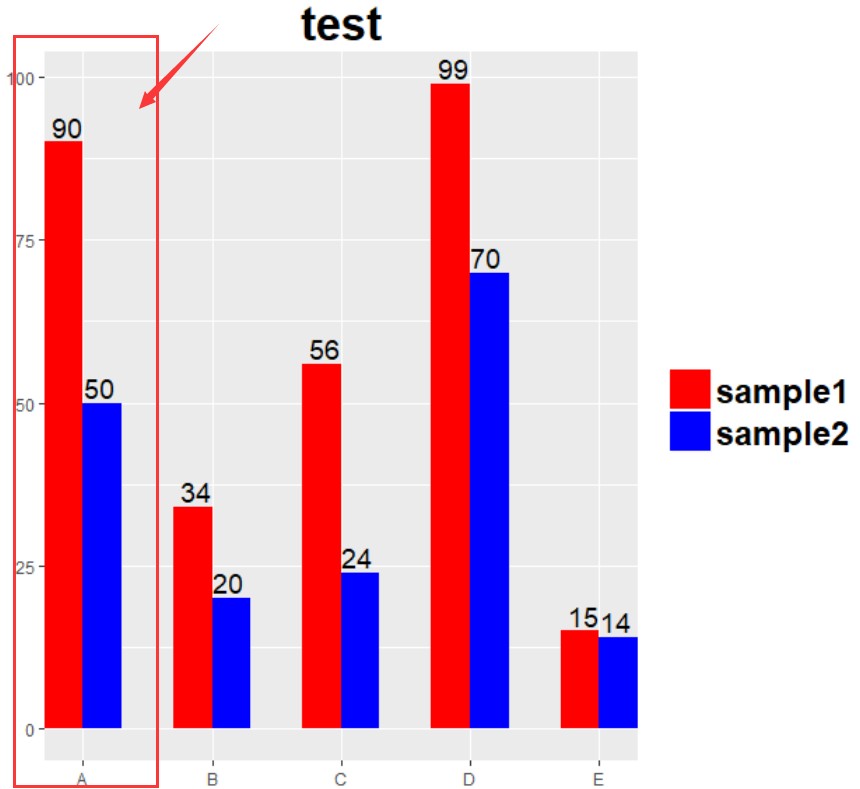
组内设置间隔
p = ggplot(dat, aes(x = type,y = Num,fill = Sample))+
    #####这部分的position_dodge(width=0.8)大于宽width = 0.6点,可以使得分组内柱子之间有缝隙,而不是贴合。
    geom_bar(stat ="identity",width = 0.6,position = position_dodge(width=0.8))+
    scale_fill_manual(values = c("red","blue"))+
    labs(x = "",y = "", title = "test")+
    ###########文字的position设置类似bar的position
    geom_text(aes(label = dat$Num),position=position_dodge(width = 0.9),size = 5,vjust = -0.25)+
    guides(fill = guide_legend(reverse = F))+
    theme(plot.title = element_text(size = 25,face = "bold", vjust = 0.5, hjust = 0.5),
        legend.title = element_blank(),
        legend.text = element_text(size = 18, face = "bold"),
        legend.position = 'right',
        legend.key.size=unit(0.8,'cm'))


print(p)
修改y轴连续性坐标起点: Y=p+ scale_y_continuous(expand=c(0,0)) Y
如果针对x离散型的调整呢?尝试调整数,使柱子紧贴Y轴 X=p+ scale_x_discrete(expand=c(0,0)) X
(责任编辑:伏泽 微信:18520221056) 
|